Announcing Monumental Puzzle Project Numero Tres!
EVERYONE INVITED! The City of the World shall be built in 2011!!!
Sign up is open now until end of January 2011. Deadline for returning a very small carved block is December 2011.
Information page: http://1000woodcuts.com/projects/cityoftheworld/index.html
As the page says, monumental puzzle projects are a collaborative effort among printmakers world-wide to compose an awesome print with little effort on the part of each printmaker.
Basically, each printmaker receives a smallish block of wood which fits neatly into the overall puzzle design. Each printmaker carves their block, returns to the coordinator and receives in turn a huge print containing the creations of printmakers from all over the world.
All the gory details on the page above. This time, in a fit of insanity, I am extending the invite to other groups so if you have your own group of printmakers, everyone is welcomed.
Once more, the information page outlines requirements, sign up form, and all the details.
http://1000woodcuts.com/projects/cityoftheworld/index.html
For those of you who have never done one of these before, here are the pages from the previous Monumental Puzzle Projects:
The Baren Puzzle #1 http://1000woodcuts.com/projects/puzzle/project.html
The Great Baren Cairn #2 http://1000woodcuts.com/projects/cairn/index.html
Pssssssssst...tell a friend!!!
Artist Maria Arango-Diener's sporadic musings on woodcuts, art, and the incredible adventure of life as an artist.
Friday, December 10, 2010
Friday, November 19, 2010
Catching up on website work
When I first started this web site "thing" I had no idea how much work it was going to be. I really just wanted a little website with some info on me, my art and the woodcut process.
Fast forward 100 years (it feels like that!) and now my website is begging to be upgraded to modern standards and split into at least two, if not three, separate sites. Sigh!
In the meantime and following the adage, "never mind that the horse is lame, load the wagon!", I continue to update my projects, works, process and whatever else I can think of. Now I also update this blog, my Facebook page, my mailing list and various online galleries. I need another Maria!
But to the current post, my very favorite updates are to upload those tiny thumbnails of each of my works on my "1000" pages.
The main page is here: http://1000woodcuts.com/1000woodcuts/1000.html
And from there you have a glimpse into my entire output since I started making woodcuts.
I love how the little tiles change with my current style...

Well, back for more updates! My database is calling.
Tuesday, November 9, 2010
'Tis the Season!!!
'Tis the Season for Shopping and thinking about giving art to everyone you know. No matter who you buy from, think about giving art this season!
Since I took a break off the festival circuit I've been searching for a way to empty my flat files so that I can happily fill them again in the next years. So the cycle begins.
During my "festival period" I was either always getting ready for a festival, going to a festival, in a festival or coming and resting from a festival. The creative spark had to take a back seat.
Now I'm back creating but I missed making that special connection with my collectors. I'm really not a gallery seeker nor an art scene groupie, so aside from festivals, connecting with collectors happens daily through the magic of the internet.
Which brings me to selling online. Definitely not all it's cracked up to be...well, maybe if you sell shoes or ladies purses, but making "a living", even a scant one, selling art online is not at all as easy as cranking out a website and waiting for the shopping cart to fill up.
So far, my best online ventures have been the unlikely wacky world of ebay http://www.stores.ebay.com/1000woodcuts and the delightful Etsy http://1000woodcuts.etsy.com/.
Ebay has by far the best traffic but can be a dangerous place; Etsy has a nice charm and is more suitable for fine prints. The price point on both of those is pretty low so I place my smaller prints and I sell unmatted and unframed. I think collectors get a good deal and all I have to do is kiss my prints and place them gently in a mailer and off they go!
But what to do with framed works, larger works and blocks? I started various other online shops through the years and traffic is just deplorable about everywhere. Many online galleries want outrageous amounts of money and don't seem to get the sales to justify the charges.
This year, I found Ruby Lane! Very elegantly done, nice offerings, great people and an overall very classy look to the website. And, very important for printmakers, no reproductions allowed! The price point is higher and that attracts a knowledgeable clientele as well. I started a shop and we'll give it a year or three and see how it goes.
They also have an alternate site, Ruby Plaza, which acommodates the lower price offerings and still (yeah!) reproductions have to be labeled as such. It's really a fine printmaker's heaven.
Anyhow, check it out for yourself. It's definitely worth a look and if you have been searching for an online shop that is classy, you might want to give it a try, tell them I sent you. Here is my Ruby Lane Shop:
NEW! Fine Art Gallery:

Shop Ruby Lane for 1000 Woodcuts
Since I took a break off the festival circuit I've been searching for a way to empty my flat files so that I can happily fill them again in the next years. So the cycle begins.
During my "festival period" I was either always getting ready for a festival, going to a festival, in a festival or coming and resting from a festival. The creative spark had to take a back seat.
Now I'm back creating but I missed making that special connection with my collectors. I'm really not a gallery seeker nor an art scene groupie, so aside from festivals, connecting with collectors happens daily through the magic of the internet.
Which brings me to selling online. Definitely not all it's cracked up to be...well, maybe if you sell shoes or ladies purses, but making "a living", even a scant one, selling art online is not at all as easy as cranking out a website and waiting for the shopping cart to fill up.
So far, my best online ventures have been the unlikely wacky world of ebay http://www.stores.ebay.com/1000woodcuts and the delightful Etsy http://1000woodcuts.etsy.com/.
Ebay has by far the best traffic but can be a dangerous place; Etsy has a nice charm and is more suitable for fine prints. The price point on both of those is pretty low so I place my smaller prints and I sell unmatted and unframed. I think collectors get a good deal and all I have to do is kiss my prints and place them gently in a mailer and off they go!
But what to do with framed works, larger works and blocks? I started various other online shops through the years and traffic is just deplorable about everywhere. Many online galleries want outrageous amounts of money and don't seem to get the sales to justify the charges.
This year, I found Ruby Lane! Very elegantly done, nice offerings, great people and an overall very classy look to the website. And, very important for printmakers, no reproductions allowed! The price point is higher and that attracts a knowledgeable clientele as well. I started a shop and we'll give it a year or three and see how it goes.
They also have an alternate site, Ruby Plaza, which acommodates the lower price offerings and still (yeah!) reproductions have to be labeled as such. It's really a fine printmaker's heaven.
Anyhow, check it out for yourself. It's definitely worth a look and if you have been searching for an online shop that is classy, you might want to give it a try, tell them I sent you. Here is my Ruby Lane Shop:
Shop Ruby Lane for 1000 Woodcuts
Maintaining all these little jewels takes time, of course, and I try not to let things get too stale on any one website. Then there's promotion and such things but life is much easier when the booth doesn't have to go up at 3:30 AM...in the wind...and cold...
Thursday, October 14, 2010
Is it January already?
Well, no, it's not January yet...but I did finish my contribution for the Wood Engraver's Network 2011 Calendar. This is an exchange of sorts, where volunteers print up 100 copies of their assigned month and receive a bunch of hand-bound calendars in return. I can't wait!
I must be getting picky in my old age because I stopped "production" to clean the block four times before I was satisfied that it was as clean a print as it would be. By cleaning the block I mean stopping, removing all ink, and recarving spots that were picking up ink without my explicit consent, the rascals!
Didn't help that I just knew that wood engravers carry around a magnifying glass everywhere they go just so they can hone in on the details. I know I do.
Hmmm...still see a speck or two...drat!
I must be getting picky in my old age because I stopped "production" to clean the block four times before I was satisfied that it was as clean a print as it would be. By cleaning the block I mean stopping, removing all ink, and recarving spots that were picking up ink without my explicit consent, the rascals!
Didn't help that I just knew that wood engravers carry around a magnifying glass everywhere they go just so they can hone in on the details. I know I do.
In any case, here is the final image. Two blocks, a standard background woodcut block and the engraved foreground in all its gory detail on end-grain maple. I used Daniel Smith inks, Traditional Black oil-based and a black/white/transparent mix for the background.
See? It is snow, it HAD to be clean! The image is from my garden, a quirky Mojave yucca that has the funniest looking seed pods. There was snow two years ago right here in the city, so I'm not completely inventing the composition. I imagine those strange looking pods dumping their seeds in the snow so that they can regenerate during the perfect spring.
I will leave you with a couple of details:
Hmmm...still see a speck or two...drat!
Wednesday, September 22, 2010
Willow Bloom, the latest moku-hanga creation
About a month ago, our desert garden decided to reward us with some color. This "desert garden" used to be referred to as "the back-40". When we first moved in we gracefully called it "raw desert" and it was near five years before we got around to planting some desert hardy plants, shrubs and trees.
Fast forward another five years of planting, moving, about a mile of drip irrigation trenching, pipe, hoses and drip heads...and VOILA! A beautiful desert garden with flowering trees, sage, and other assorted Mojave native and Mojave hardy plants.
The willows, my first tribute to the garden, bloom all summer and recently in early fall. Here is my tiny willow bloom:
And the blocks that went into making of the willow bloom, sans words:
That's about it! I'm on to my second garden creation, the beaver tail blooms! This time my key block will be cherry which will allow me to do a more detailed line guide. Of course this will also raise the "degree of difficulty" for registering the key blocks but I think I'm ready.
Fast forward another five years of planting, moving, about a mile of drip irrigation trenching, pipe, hoses and drip heads...and VOILA! A beautiful desert garden with flowering trees, sage, and other assorted Mojave native and Mojave hardy plants.
The willows, my first tribute to the garden, bloom all summer and recently in early fall. Here is my tiny willow bloom:
 |
| Mojave Willow 2010 Copyright Maria Arango |
That's about it! I'm on to my second garden creation, the beaver tail blooms! This time my key block will be cherry which will allow me to do a more detailed line guide. Of course this will also raise the "degree of difficulty" for registering the key blocks but I think I'm ready.
Thursday, September 9, 2010
Last but not least, the hanshita paper transfer for woodblock printmaking
As I mentioned earlier, hanshita paper is simply a tracing paper that has been glued temporarily to a heavier stock paper. This allows the paper "sandwich" to be printed on any ink-jet printer and the tracing paper to be glued to the block without wrinkling or buckling.
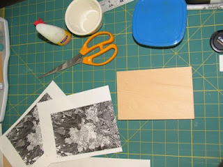 The hanshita printout is perfect with all the detail intact. The needed tools are some rice paste or wall paper paste (anything that is removable later with water), and a sponge brush or, my preferred method, a sponge roller.
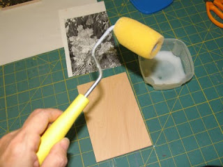 These rollers make quick work of the task of spreading a perfectly even layer of rice paste over the block. They come in all sizes!
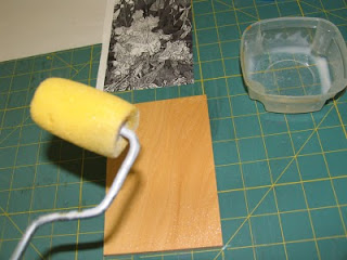 There it is, a nice even light layer. I found the compromise between too much paste, which makes the tracing paper tough to remove later, and too little paste, which causes the tracing paper to peel off during carving. Sometimes it peels off before I am done carving details and I'm left to guess where the stem of the flower should be.
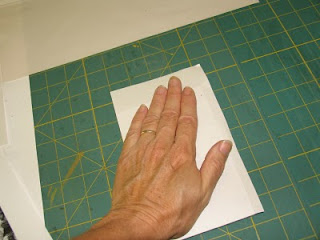 I just hand press the paper onto the block after aligning it carefully. I smooth it down evenly but not too much so as not to disturb the tracing paper.
The heavy backing paper is easily removed either while the rice paste is still a little wet or later after it has dried some. I have found no difference regardless of when the backing is removed.
 If the ink was not dry on the paper for very long, it will actually transfer nicely to the block. The tracing paper can be rubbed very gently and removed leaving the ink-jet transfer on the block. I'm almost always too scared to do this so I just let the tracing paper dry under some weight to prevent any buckling. The carving can then proceed right through the paper.
 The hanshita printout is perfect with all the detail intact. The needed tools are some rice paste or wall paper paste (anything that is removable later with water), and a sponge brush or, my preferred method, a sponge roller.
 These rollers make quick work of the task of spreading a perfectly even layer of rice paste over the block. They come in all sizes!
 There it is, a nice even light layer. I found the compromise between too much paste, which makes the tracing paper tough to remove later, and too little paste, which causes the tracing paper to peel off during carving. Sometimes it peels off before I am done carving details and I'm left to guess where the stem of the flower should be.
 I just hand press the paper onto the block after aligning it carefully. I smooth it down evenly but not too much so as not to disturb the tracing paper.
 If the ink was not dry on the paper for very long, it will actually transfer nicely to the block. The tracing paper can be rubbed very gently and removed leaving the ink-jet transfer on the block. I'm almost always too scared to do this so I just let the tracing paper dry under some weight to prevent any buckling. The carving can then proceed right through the paper.
 The hanshita method yields perfect design transfers every time, which is why I use it most often on smaller works.
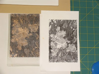
Lastly, a side by side by side comparison of the three transfer methods, the Studio Paper on the left, the ink-jet t-shirt iron-on in the middle and the hanshita on the right. The untransferred design is shown below each block.
I tint and oil the block a bit before carving and they all took ink and oil similarly except the iron-on transfer did not let the oil seep into the block. The block still carved fine right through the rubbery layer but, despite a perfect transfer, I probably won't use it because of that. Either of the other two methods works well, with the Studio Paper giving a slightly "freer" feel to the block since there is no paper adhered and the hanshita winning the detail-transfer race since the tracing paper gives slightly better contrast.
Transfering design to block with Iron-on T-shirt transfer
 Here is the printed iron-on transfer stuff. The printout showed all of the fine detail with very good contrast so I was encouraged.
The detail of this transfer was probably the best of the three because of the high contrast.
 Bring on the heat! I used an iron that's perhaps older than me...well, maybe not. This method needs a high heat setting and no-steam setting. I keep this old fashioned plain iron in the studio for just this type of project.
It takes some pressure and quite a high setting. My mini-iron (used for crafts) did not work; had to be a full-size iron.
The process of transfering with this method also "tanned" my block so no tinting would be necessary later.
The drawback is that the transfer is a rubbery ink designed for t-shirts, so there is quite a bit of relief that transfers to the block. It scrapes off easily enough, but it does transfer a film of rubber all over the block, even the white parts. I carved a little on it and the film comes off fairly easily by pulling it up without damage to the block.
Here is the enlargement of the transfer printed and on the block:
On to transfer number three, the hanshita.
Transfering design to block with Studio Paper
It has been an experimenting year for me so I wanted to try out different methods of transfering image to block. I vary my own approach, depending on what my plan is with a certain image.
For multi-color woodblock prints, I almost always carve the key block and print on hanshita paper as many times as I will need color. For reduction blocks, it really doesn't matter so much; if my composition is complex and I need to work out things in Photoshop first, then I might use one of the methods below or simply transfer with tracing paper.
Most of my designs are drawn straight on the block with sumi ink. It really just depends on what print, how much detail, method, etc. But I wanted to add a few more methods to my arsenal, just in case. These three are very suitable for highly detailed work and for printouts from any printer.
Left to right, these are three printouts from my computer. First is Studio Paper, a transfer medium which I purchased online at http://www.imcclains.com/.
In the middle is iron-on t-shirt transfer for ink-jet prints, available at any office supply store.
Last is the hanshita paper, a tracing paper attached lightly to a tougher sheet. This paper goes through any printer and is availabe from the supplier above and also from the Baren Mall at http://www.barenforum.org/ click on Baren Mall from there.
I first cut the three printouts to size; I'm working on 4x6 shina blocks.
The Studio Paper, a waxy paper that leaves the ink from the ink-jet printer very "wet" and requires little pressure to transfer, gave me a very light printout, although the detail was fine enough.
I simply lined up the corner of the block and pressed down lightly with a "doorknob-baren". Any pressure implement will do. The paper is slick and the ink is still wet so care is needed to avoid blurring.
I checked as I went along to see how the transfer was coming along. The Studio Paper transfered quickly and cleanly with very little pressured.
Overall, I was impressed with the detail, although I would have liked the ink to be a tad darker on the block. I am transfering on bare blocks for this experiment and usually I would have tinted the blocks with walnut or gray ink to help later in carving.
Aside from the lightness of the transfer, the Studio Paper worked as advertised! I'm always a bit skeptical about these products but this one works.
Next I will try the iron-on stuff. Last picture is a close up of the detail from the studio paper transfer.
Thursday, August 26, 2010
Methods of transfering design to block Part I
 My preferred method of committing design to block is to simply draw on the block. I do this either with sumi ink and a brush or with a "magic" permanent marker, depending on the design. Sumi-ink drawings are more fluid and resemble more Chinese or Japanese designs while permanent marker drawings can be more detailed and "Western" looking.
Working out compositional details with pencil first eliminates the fear of committing drawing to ink. Pencil or charcoal on block can be erased easily. Two cautions: heavy application of graphite can leave a greasy film that will not accept marker or ink later, and too much pressure applied with a sharp pencil on soft wood will leave an indentation that may show on light printing.
One drawback with the direct draw method is that the design will be reversed in printing, but with some years of practice it seems I have learned to "flip on my head" and end up drawing exactly a flipped version of what I really wanted.
Once the drawing is finished, it can be transferred to the block by flipping the paper over the block and using either carbon paper or charcoal rubbing.
In the case of tracing paper, the drawing can simply be pasted down on the block with rice paste and the carving proceeds right through the paper.
One of my favorite types of carbon paper is a red paper sold at http://www.imcclains.com/ that is soft and transfers even the slightest line. I am also the proud owner of a stack of about 400 sheets of old typing carbon paper picked up on eBay for about $2.98. Pressing down too hard when transferring with carbon paper can leave a dent in soft wood blocks.
For transfers which are drawn (or photographs) and printed from a computer, the method I have been using most is printing on a plastic substrate such as transparency film. This is the stuff that was used in overhead projector presentations before the advent of MS PowerPoint.
I use laser transparency film and print on an ink-jet printer. The ink-jet ink remains wet and much care is needed not to drop it on the way from the printer to the studio, since it will invariably fall on its "face" (like the proverbial buttered toast) and will make a mess out of both the transparency and the floor. Not that that's ever happened to me.
In any case, the procedure is simply to work out the drawing or photo on the computer, print on the transparency, place the transparency face down on the block carefully and apply hand pressure to transfer the ink. Excellent detail can be achieved with this method.
Moving right along, this year I'm in an experimenting mood and I acquired some "Studio Paper" a wax coated paper, also from McClain's and a few sheets of iron-on transfer for ink-jets from my nearest office supply store. The last method, and the one I use most often now, is the traditional hanshita from Japan; I purchase prepared paper from the Baren Mall http://www.barenforum.org/ but it is easy enough to make my own.
The illustrated story of those last three methods in the next post, the dreaded sequel: Methods of transfering design to block Part Deux.
Monday, August 16, 2010
One more trick on the eternal quest for perfect registration!
For my last print (previous blog post) I wanted to print through the press and maybe do a reduction or two on some of the blocks. With so many decisions to make along the way, the most flexible approach to registration is to resort to the traditional Japanese kento-cut-on-block method.
My usual M.O. is to cut the key block, kento and all, and print several copies on prepared hanshita paper to simply paste on the color blocks. I have a left handed toh to avoid flipping the block while cutting the kento; I have pretty good transfer and glue skills and getting better all the time at actually cutting the darned things straight and square.
And yet I always have to strive for another tweak that will make my art life less stressful and more efficient. The solution is so simple I don't know why I didn't think of it before.
Roughly, the tools needed, left to right:
-Close-up glasses if you are over 50 (yeah, even barely over 50)
-The block, of course, with freshly pasted hanshita or drawn kento
-A smallish steel square
-Cutting tool of choice, shown a toh and a standard utility knife
-Clamps behind the block, the quick release type
-Cat licking itself (optional to make things interesting)
1. Here we go, step numero uno is to carefully place the square EXACTLY on the kento marks.
You can place the square inside the line or outside the line or right on the line as long as you do it the same way on every block.
The easiest thing is to place it exactly ON the line, then you don't have to remember anything.
 2. Once the square is on the line, clamp it down to the block with the quick release clamps firmly on two or (better) three spots.
For this step, the block has to be placed slightly off the edge of the table or work bench.
There is an illustration of clamping down the square. Notice I made some "tick marks" on the hanshita to help me find the beginning and end of the kento.
3. After clamping, just cut along the square keeping the blade perfectly vertical to the square.
I like to make a very "soft" cut at first and dig in gently with subsequent passes. Digging too hard on the first few cuts can result in the knife slipping away from the square.
And yes, I can cut with my left hand, not just faking it for the picture. Teaching the left hand to cut if you are right handed does wonders to avoid fatigue of the joints.
As I mentioned before, I have both a left and right handed toh for cutting kentos. But a simple and much cheaper solution for the initial cuts is to use a standard utility knife. The blade is certainly strong enough for Shina ply and other soft woods and will also work on cherry with some repeated cuts.
I must say there is a world of difference between using the toh and the utility blade! Even my cheapest toh digs into the wood much easier than the soft utility blade. But the utility knife does an amazing good job in a pinch.
Check it out, perfectly squared and straight kentos! Every block, every time, perfect registration to the mil!
My usual M.O. is to cut the key block, kento and all, and print several copies on prepared hanshita paper to simply paste on the color blocks. I have a left handed toh to avoid flipping the block while cutting the kento; I have pretty good transfer and glue skills and getting better all the time at actually cutting the darned things straight and square.
And yet I always have to strive for another tweak that will make my art life less stressful and more efficient. The solution is so simple I don't know why I didn't think of it before.
Roughly, the tools needed, left to right:

-Close-up glasses if you are over 50 (yeah, even barely over 50)
-The block, of course, with freshly pasted hanshita or drawn kento
-A smallish steel square
-Cutting tool of choice, shown a toh and a standard utility knife
-Clamps behind the block, the quick release type
-Cat licking itself (optional to make things interesting)
1. Here we go, step numero uno is to carefully place the square EXACTLY on the kento marks.
You can place the square inside the line or outside the line or right on the line as long as you do it the same way on every block.
The easiest thing is to place it exactly ON the line, then you don't have to remember anything.
 2. Once the square is on the line, clamp it down to the block with the quick release clamps firmly on two or (better) three spots.
For this step, the block has to be placed slightly off the edge of the table or work bench.
3. After clamping, just cut along the square keeping the blade perfectly vertical to the square.
I like to make a very "soft" cut at first and dig in gently with subsequent passes. Digging too hard on the first few cuts can result in the knife slipping away from the square.
And yes, I can cut with my left hand, not just faking it for the picture. Teaching the left hand to cut if you are right handed does wonders to avoid fatigue of the joints.
As I mentioned before, I have both a left and right handed toh for cutting kentos. But a simple and much cheaper solution for the initial cuts is to use a standard utility knife. The blade is certainly strong enough for Shina ply and other soft woods and will also work on cherry with some repeated cuts.
I must say there is a world of difference between using the toh and the utility blade! Even my cheapest toh digs into the wood much easier than the soft utility blade. But the utility knife does an amazing good job in a pinch.
Check it out, perfectly squared and straight kentos! Every block, every time, perfect registration to the mil!
Thursday, August 12, 2010
My studio smells like HONEY!?
I began experimenting with Akua-Kolor inks with my last two moku-hanga prints of the Valley of Fire. They work exceptionally well for this traditional Japanese method, but I also wanted to try them in the Western roll'em'up'n'press'em method (that is a long technical term requiring more explanation than this blog can possibly get into).
The best part of Akua-Kolor is that my studio smells like honey when I hang up the prints to dry. It is the sweetest smell! Maybe I just like working consistently again.
Anyhow, nothing like a print exchange or seven to get the presses rolling, or the baren sweating, or whatever. So for my Baren Exchange #45 I decided to jump right into the thickener of things and roll out the Akua.
The colors are amazingly impressive, the purity of the transparency is just incredible; I can't think of another word for it. Here are some of the plates:
Oh, forgot, if you are in Barenforum.org Exchange #45 and like surprises, read the rest of the blog post with your eyes closed.
 The theme was "maps" so I went "flying" over the earth until I found a neat spot (insert credit here to Google Earth).
Key block on the right printed in violet/purple/umber containing all of the relief and some ancient petroglyph symbols thrown in for good measure.
Blue block on the left with the lake, river and anywhere I wanted blue or green.
So far, so cool...
Hansa Yellow on the right printed all over the areas surrounding the lake to make my brown eyes blue...er, to make some of my blue areas green.
The transparent sienna/orange plate was really a second state. After printing the first three plates, I wanted to "kill" the contrast a little and produce two more colors: a light sienna/orange over the cream paper and a slightly more rusty purple/umber over the open areas of the key block.
Next picture is the first three plates combined to make a "State 1" which really makes the blue POP!
114° 23' 49" W
The best part of Akua-Kolor is that my studio smells like honey when I hang up the prints to dry. It is the sweetest smell! Maybe I just like working consistently again.
Anyhow, nothing like a print exchange or seven to get the presses rolling, or the baren sweating, or whatever. So for my Baren Exchange #45 I decided to jump right into the thickener of things and roll out the Akua.
The colors are amazingly impressive, the purity of the transparency is just incredible; I can't think of another word for it. Here are some of the plates:
Oh, forgot, if you are in Barenforum.org Exchange #45 and like surprises, read the rest of the blog post with your eyes closed.
 The theme was "maps" so I went "flying" over the earth until I found a neat spot (insert credit here to Google Earth).
 Key block on the right printed in violet/purple/umber containing all of the relief and some ancient petroglyph symbols thrown in for good measure.
Blue block on the left with the lake, river and anywhere I wanted blue or green.
So far, so cool...
The transparent sienna/orange plate was really a second state. After printing the first three plates, I wanted to "kill" the contrast a little and produce two more colors: a light sienna/orange over the cream paper and a slightly more rusty purple/umber over the open areas of the key block.
Next picture is the first three plates combined to make a "State 1" which really makes the blue POP!
And finally, the four plates combined to make "State 2" with the transparent rusty stuff all over. The blue still pops fine and there is more of a SW earth to it. Or something.
I haven't made my mind up which state I like best or which orientation I like best either. Looks good vertically too. Maybe I will sign it in all four directions and let the viewer place as they like it. The original reference is flipped but I liked it this way better.
I have a title this time:
36° 08' 45" N
114° 23' 49" W
Monday, July 19, 2010
Geographical Divides project is done...and needs a title!
Here it is drying away in my studio. My print for the Geographical Divides print exchange among Nevada printmakers is done!
And this is where YOU, the viewer comes in! I am totally blanked out on a title. Here is the background of the project in a nutshell (or go to http://geographicaldivides.blogspot.com/ ):
Nevada printmaker and prof Anne Hoff, along with the tireless Candace Nichol decided to organize a print exchange between Northern and Southern Nevada printmakers. Not content with a standard exchange of prints, ha, the project dictates that a N printmaker starts a block, sends to a S printmaker who works on it. Then the original N pmker modifies the image again, prints and sends to coordinator. Some artists worked together on their project, but some of us were, er...geographically divided.
So my partner Lynne and I worked without meeting and decided on the theme "rural meets urban", something we both live and watch. I sent Lynne four pieces of my block in the true spirit of a puzzle block; she carved them, I received them back and proceeded to make them fit into a pictorial "whole".
The result is below, I wanted to do something with topo map "feel" following the overall theme; thinking of an image is hard enough, but when faced with someone else's interpretation, the degree of difficulty is raised substantially. My M.O. is usually to make a unified "narrative" regardless of how many different pieces I'm faced with. Since Lynne pretty much took care of the "rural" bit, I proceeded to fit her critters with some urban grids and symbols, splashed some color here and there somewhere between topo and traffic light, and came up with a four state reduction.
Incidentally, for those of you who don't know, that is roughly (very roughly) the alignment of Las Vegas (South) and Reno (North) within the mountainous great state of Nevada.
Now that you know all about it, I need a danged title! "Untitled" just doesn't do anything for me...would you help?! Either comment or send me an email to 1000woodcuts AT gmail DOT com
Da print:
Thursday, June 24, 2010
Last week at the Valley of Fire, it's getting HOT!
I've been visiting the Valley of Fire weekly to keep up with my show. This year the lizards seem to be in great health and, early in the morning, come out in the open to sun themselves and enjoy the morning I suppose, just like the rest of us. When I first get there and snap some quick pictures, the thing that strikes me the most is the absolute silence. My feet crunch the sand and the only sound when I stop is the breeze russling through the pods in the various bushes, now beginning to dry and drop to the ground.
This guy was about 18" long and must be in the welcoming committe, right at the visitor's center parking:
This will be the last week my work will be at the Valley of Fire. Below some pictures of my little display area.
Subscribe to:
Comments (Atom)


